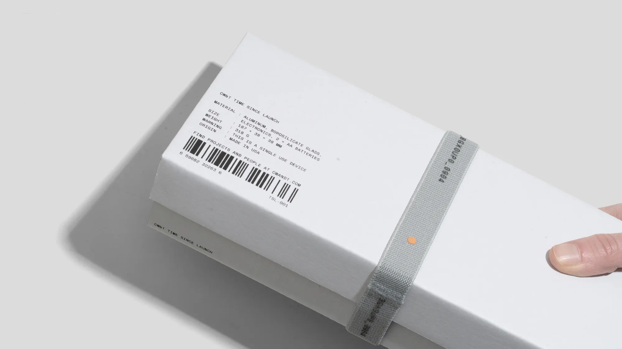
It cannot be fussy.
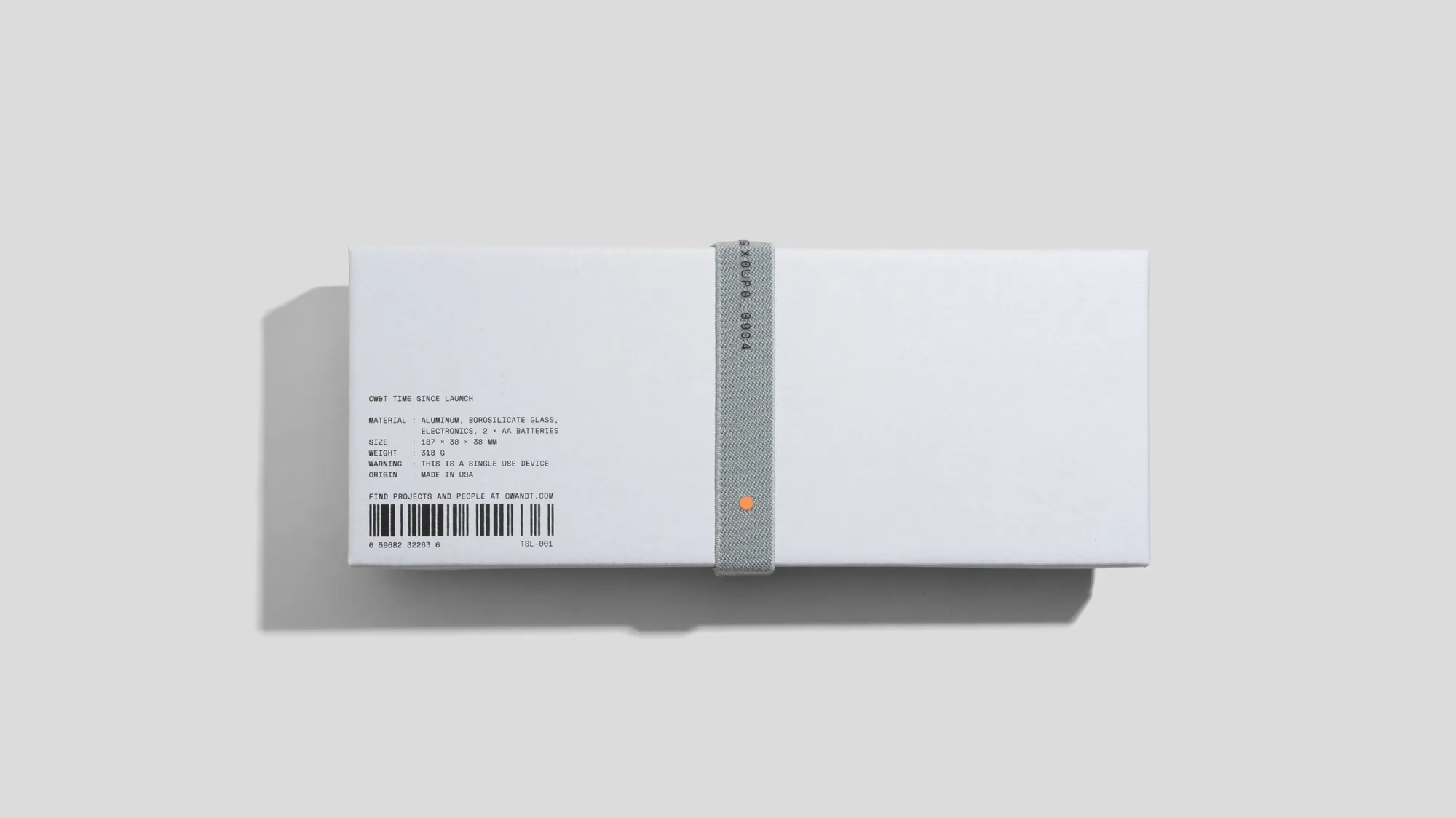
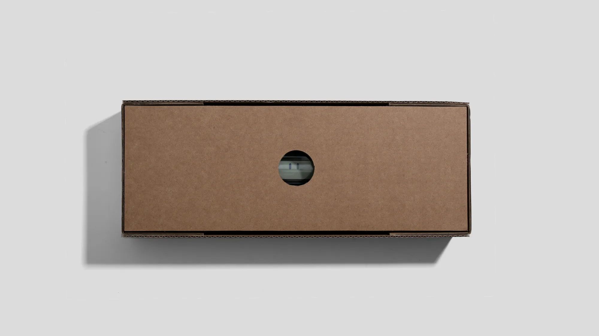
Taylor likes the aesthetic of pizza boxes, the quality of the print and the material. Che-Wei likes bank boxes, how they nest and are good for storing stuff. Our packaging cannot be fussy. It cannot be wasteful. Could it be functional afterwards? How does it look on a shelf? in the Annex? Neon orange sucks for printing. Again, it cannot be fussy. It cannot add unnecessary extra cost to the person buying the thing. It cannot feel like we are using packaging to trick someone into thinking the thing is fancier than it is.
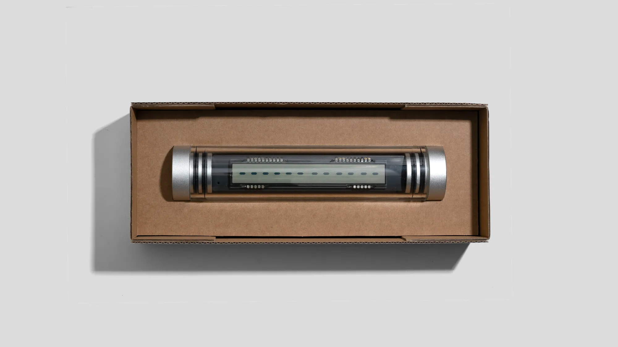
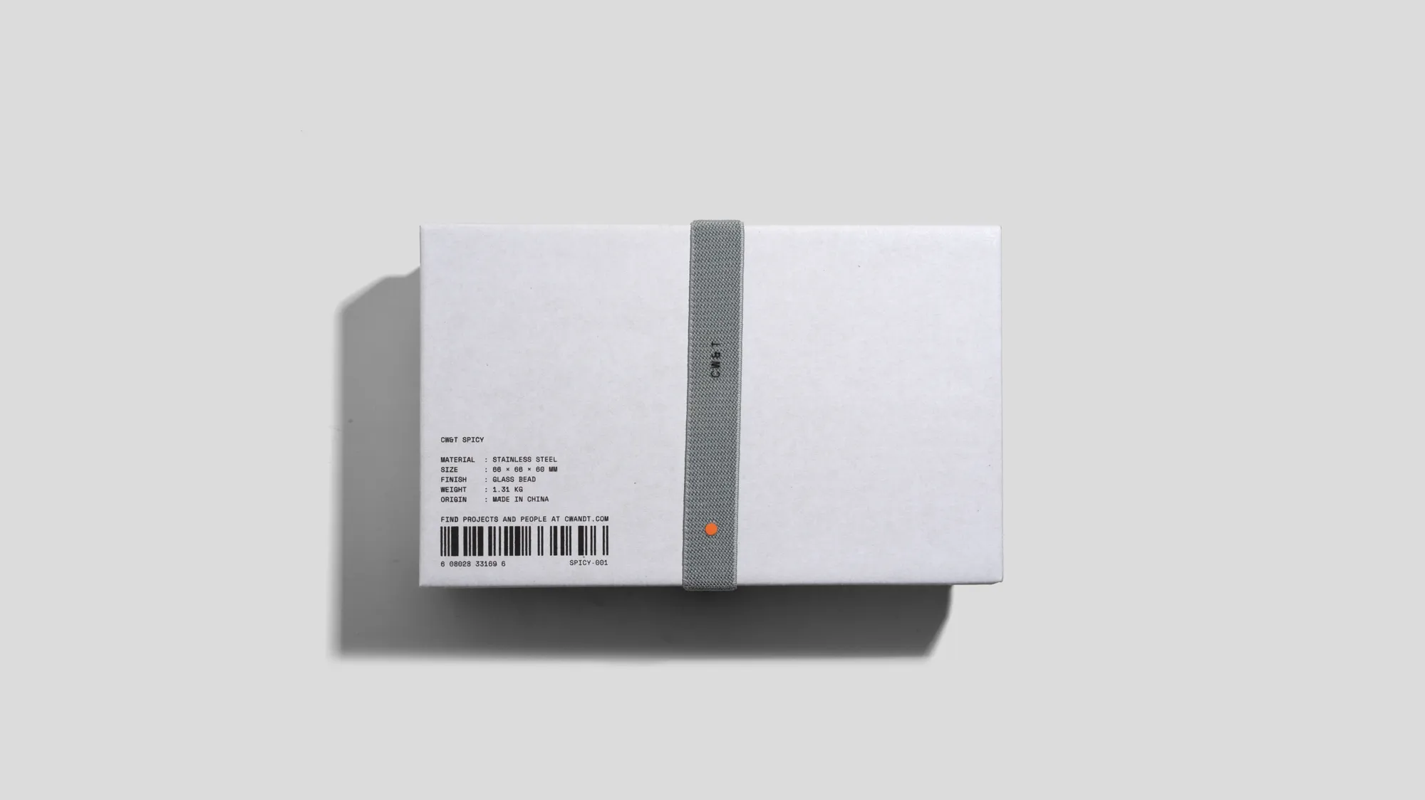
If you've ordered one of our newer products recently, it's possible you've glimpsed and fondled our new packaging. We're really happy about it, especially since after it's done getting your thing to you, it's a pretty cool useful box.
Time Since Launch + Standard Paper Option
We just launched our standard paper packaging as a purchase option for Time Since Launch. We still have the black cork boxes for gifting occasions, but the cork is pricey and we wanted to give people this other option.
Many thanks to the designers who worked with us and counseled us (yes, it was often like therapy) throughout the making of this packaging. ooooaaa.studio who did a lot of legwork and patiently dealt with us. Keira, who generously wrangled this effort with more care than she needed to. And Wade + Leta who happened to show up one day and volunteered some guidance. Staples over MoMA came out of that, which captures the vibe in its entirety.
Here are some snaps of some of the other items that have made the transition to new CW&T standard packaging: Spicy, M.R. Tape Dispenser Magnetic Base and Studio Sketchbook Grid.
With love and hugs,
Che-Wei + Taylor